They say change is as good as a holiday, especially when it comes to branding.
Expand a Sign have always embraced change as an opportunity to engage with our customers by providing insight into the processes involved in updating one’s corporate identity.
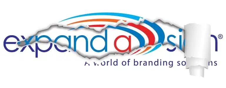
Expand a Sign is embarking on a soft re-brand, so what does this mean?
A soft re-brand is an opportunity to freshen up and modernise our corporate identity without losing the value of the brand we’ve built over the last 20 years.
Research shows that the use of too many colours in a logo may appear as distracting and confusing, with many brands nowadays opting for a simpler and cleaner colour palette.
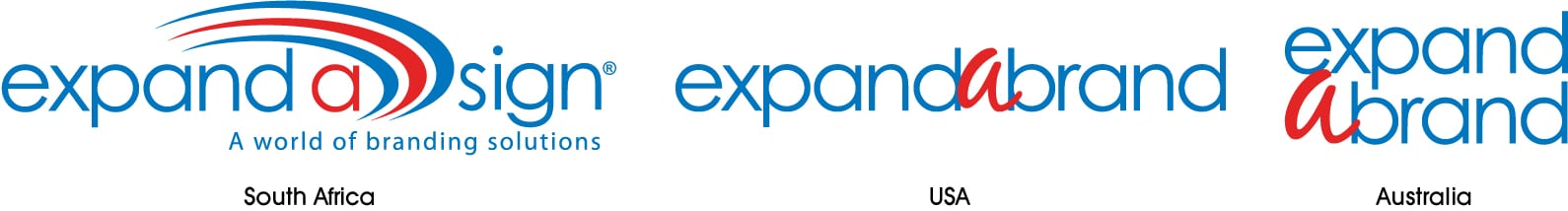
Consistency is key…This is an opportunity for us to embrace our connection with ExpandaBrand USA and ExpandaBrand Australia, by creating a greater sense of brand unity through the use of colour and further enhancing our status as a global brand and creating a greater sense of brand unity.
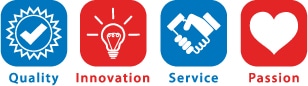
So why Blue and Red?
Blue: Symbolises pride, professionalism and reliability. Blue evokes trust, strength and power which complements our 2 pillars “Quality and Service”
Red: Is visually stimulating and raises pulse rates. Red is exciting, bold, sexy and youthful which are represented by “Passion and Innovation”.
There are many aspects to consider whether or not your corporate identity is due an upgrade, so we’ve highlighted a few key factors in our blog to help you with your decision IS IT TIME TO RE-BRAND?