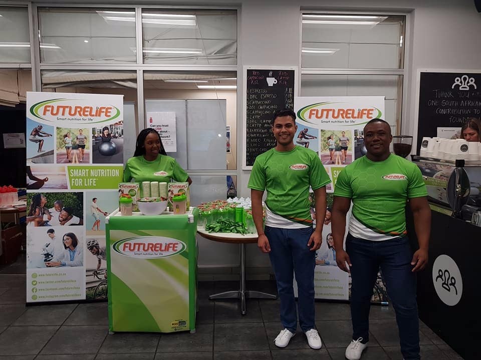
An effective Pull Up Banner design is vital as these banners are an important resource for anyone showcasing their brand at expos, product launches, activations or in-store promotions.
Pull Up Banners are one of the few branding items that can be placed virtually anywhere people are going to congregate and is best used in addition to your existing point of sale material. However, this means getting the right design and information on your banner stand is so important in order to create a meaningful impact – an area where many fail.
A Pull Up Banner should be treated like any other part of your marketing strategy and it should be given the same attention. It is a way of promoting your brand and product or services to a captive audience, so it is important that your design is effective in getting across the message you want.
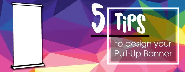
Here are 5 Essential Pull Up Banner Design Tips for Effective Branding.
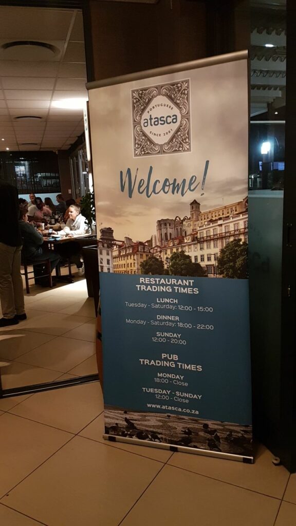
KEEP YOUR LOGO AT THE TOP OF YOUR PULL UP BANNER DESIGN
It is important to have your main message at eye level.
Whether this is your company slogan, an image of a product or information about the services you offer, this is the area that is most likely to grab a customer’s attention as they walk past.
THINK TOP-TO-BOTTOM & LEFT-TO-RIGHT
People are used to reading top to bottom and left to right, so keep this in mind as you start laying out the flow of information on your pull up banner. It is also important to only include relevant information and keep text to a minimum. Your sales team or associated brochures can provide additional info – less is definitely more.
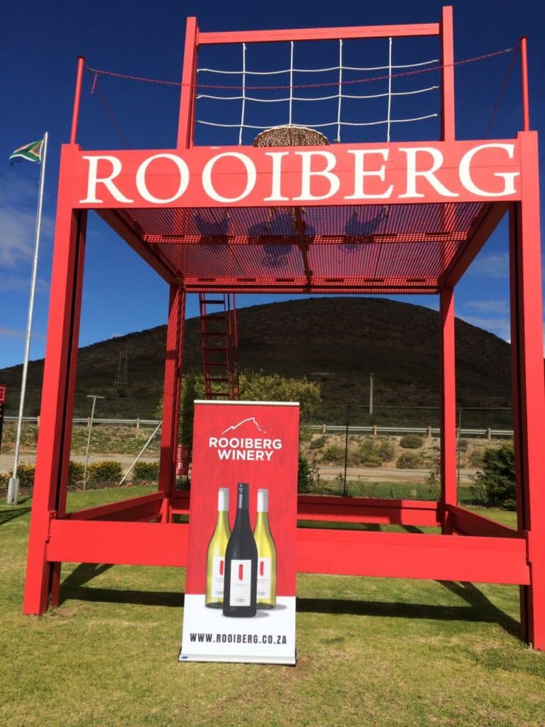
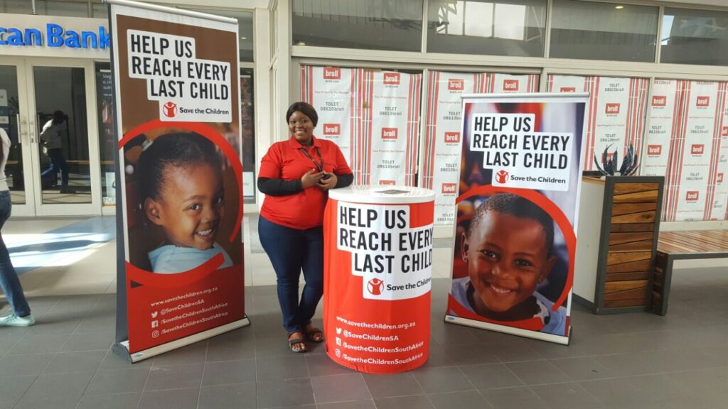
HIGH-QUALITY IMAGES ARE ESSENTIAL FOR YOUR PULL UP BANNER DESIGN
If you are going to include images on your pull up banner, then be sure that they are high-quality. Ideally they should be 300dpi and saved as CMYK. Poor quality images downloaded from the web won’t do your branding any justice.
Remember, you are trying to capture people’s attention and draw them towards your products.
COLOUR IS YOUR FRIEND
Colours can help make you stand out but they have to work well with your corporate identity. It is also important to consider the impact of background colour in relation to text and images. All images and text must be clear and easy to read. Bright colours like red and orange can really grab your attention but avoid using yellow and white together, as this makes it difficult to read information. Contrast is key.
CONTACT DETAILS
Last tip when designing your pull up banner, is contact details. This is particularly important for an exhibition where you may not get a chance to engage with every customer. Contact details are often best placed towards the bottom of a pull up banner and must be clear to read. Include your website, contact number and email address.


If you’d like these tips in a simple to read illustration, you can download the pdf here.
Be sure to check out our previous blog on our Pull Up Banner range. Here you will learn about the benefits and differences between our Ex-T, Ex-T Lite, Ex-T Cut-Out and Ex-Roll Banners.